.svg)
For the purpose of the online portfolio, confidential information had been obfuscated. The full case study for this project will not be disclosed due to confidentiality.
An optimal experience lies beyond the end users. We can't take our internal users for granted to ensure sustained scalability.
In 2021, the internal pioneer group of UX team in ST Engineering went through a revamp of manpower timesheet tracking tool used within the company. Prior to the introduction of any UX initiative, the core processes within the internal team lies in adoption of online UI framework libraries for design and development of in-house digital products.


Major UI accessibility issues pose challenge to users' recognition
Error messages were ambiguous and not specific to assist diagnosis and recovery
8/12 users were unsure of how to navigate back to home page after task completion
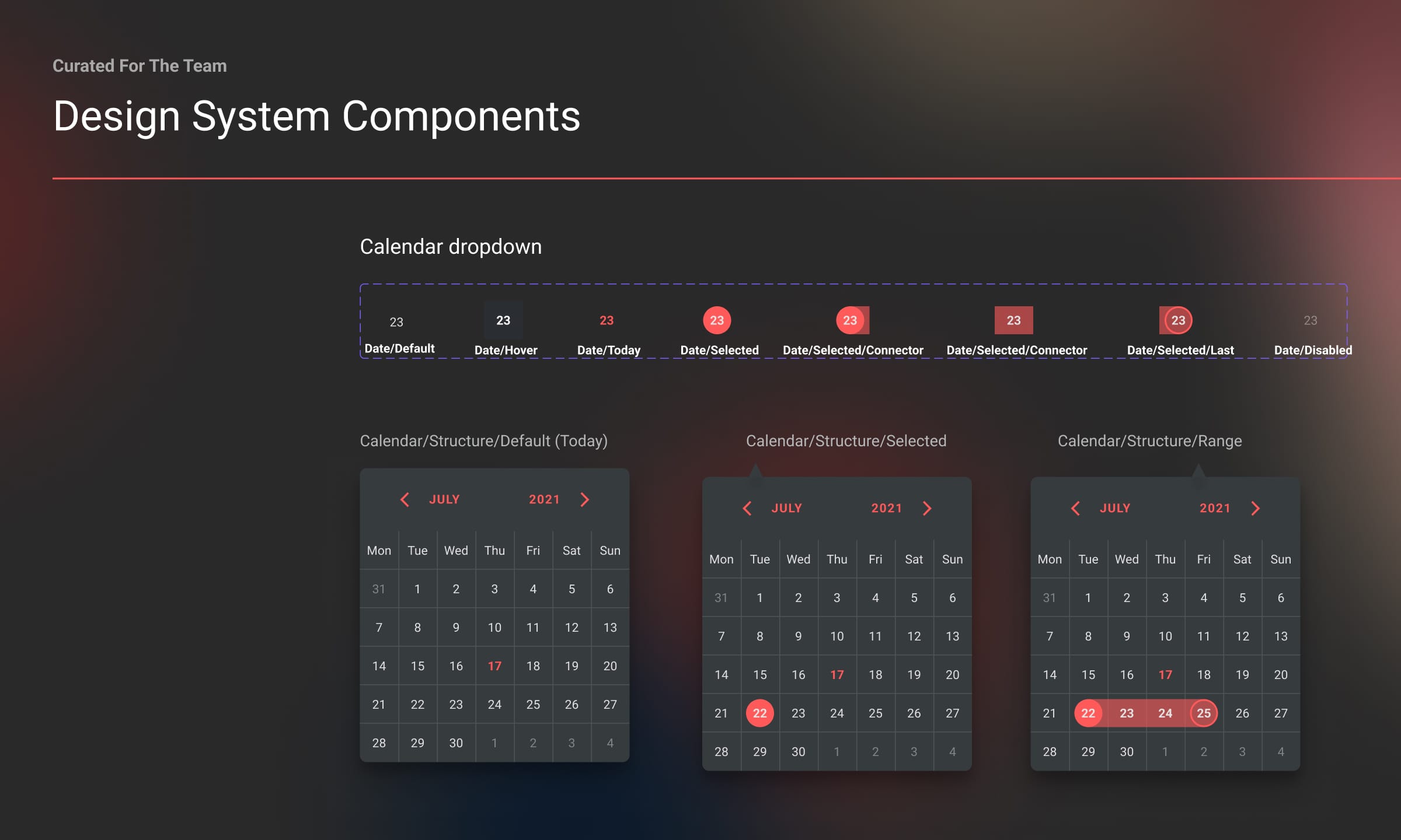
Labels and legends were not clearly communicating the calendar events to users
Note: Image is intentionally blurred to keep confidentiality.

Setting foundations to the design system is key to educate UX designers and developers on the core principles of the product.

Cards were designed with the intent as building pieces of reusable components which could be easily customised for different use case scenarios and screen designs.
.svg)

In the previous design, users had to navigate from home page > timesheet page > before selecting on a specific project to perform their task.
8/12 users were unsure of how to navigate back to home page after task completion

In the new design, users will be directly brought to the timesheet to perform their tasks as required, reducing the number of taps (mobile app) and clicks (web).
Direct access to task is supported to avoid potential navigation pitfalls
.png)
The modular components were crafted with the intent to be individual "lego variant" allowing UX designers and developers alike to adapt to the different use case scenarios efficiently.
.svg)

In the previous design, error messages were ambiguous and did not communicate the exact problem to users. This resulted in task failures and drop offs.
Error messages were ambiguous and not specific to assist diagnosis and recovery

In the new designs, we have added a library of potential error scenarios for UX designers and developers alike to plug and use as required. Clarity of communication was the core of our focus with clear articulation of problems and proposed solutions if available.
The scenarios were developed together with the development team
.svg)
Aside from mobile platform, this design was implemented on the web platform as well. As the development team is new to grid layouts and responsive design, we invested in efforts to provide supportive introductory sessions to bridge the knowledge gap.

The hesitant to change is clearly evident as internal teams embark in an unfamiliar territory
We thus seek to examine the internal development team's intent and context of use. We also considered how we could empower future UX designers to effectively use this design system to expedtie their workflows.

Snippets are shown below, full disclosure will not be revealed to maintain confidentiality
.png)
.png)
I'm a strong believer of an advocate for change despite resistance and ingrained mindset in legacy way of work. In considerations of design system, we wish to move beyond modular components to sync design and codes simultaneously. Development library could be generated to setup the production infrastructure for more efficient frontend development. Besides, application workshop with a clear learning agenda will be the key to championing design system usage.
